easely.
Product & PAckaging design
Tools Used: Illustrator, sewing & embroidering machine
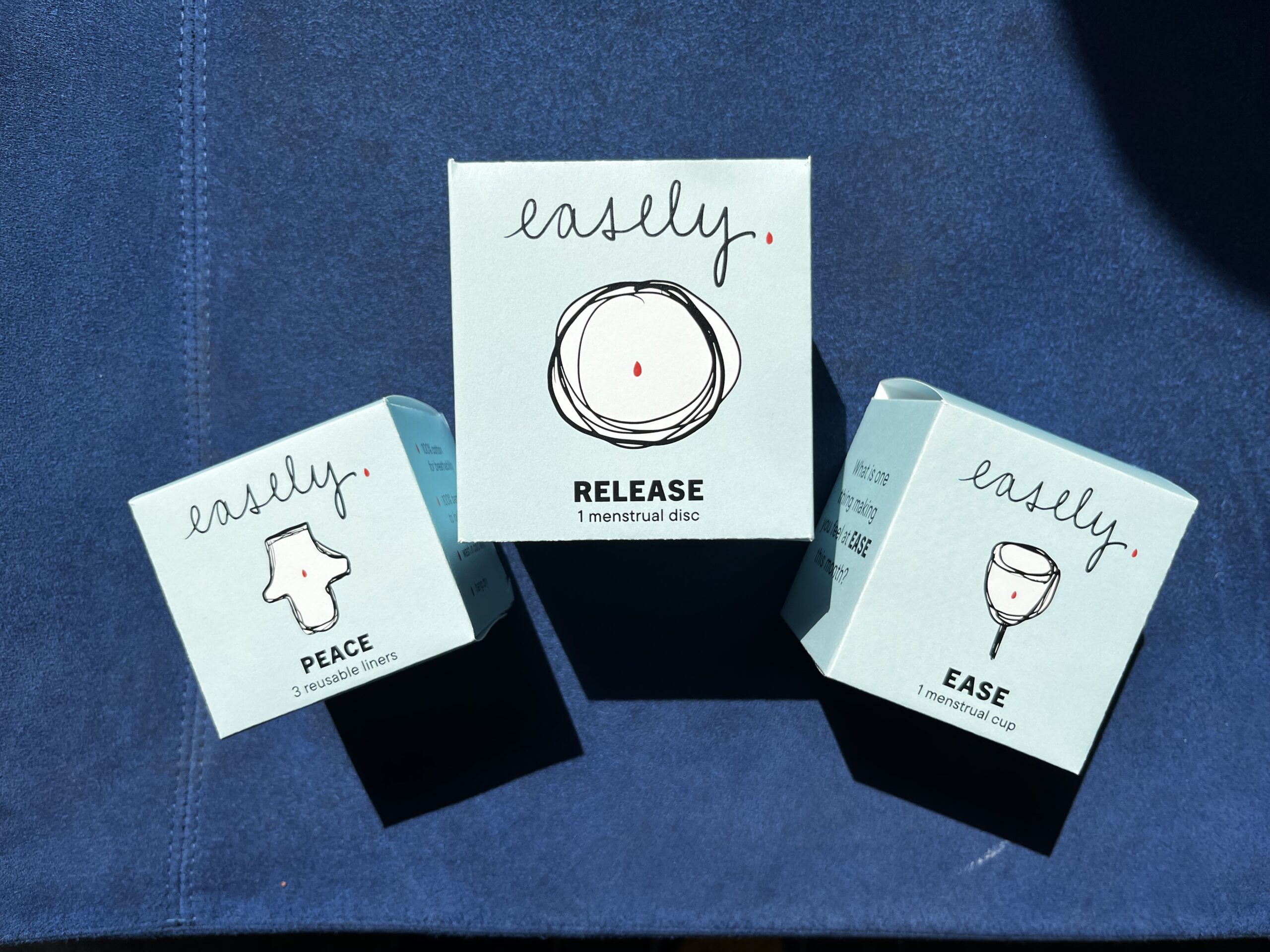
easely. is a conceptual eco-conscious menstrual product brand focusing on ease and honoring the Earth.
The goal here was to create a brand, logo, and packaging for a set of products in a family, including a shopping bag.
Experience
In this season of my life, I recently switched over from using a menstrual cup, which I've used for over a decade, to a menstrual disc. As a menstruating woman with over 120 cycles of experience, I've influenced many of my friends to switch over from single-use, disposable pads, tampons, and liners, to reusable liners, cups, and hopefully now the disc.
There is less waste and it is so much better financially! They are all easy to learn how to use and are the best things to travel with!
If I ever create a company, I want it to honor the Earth as there is already so much consumption and waste from businesses.
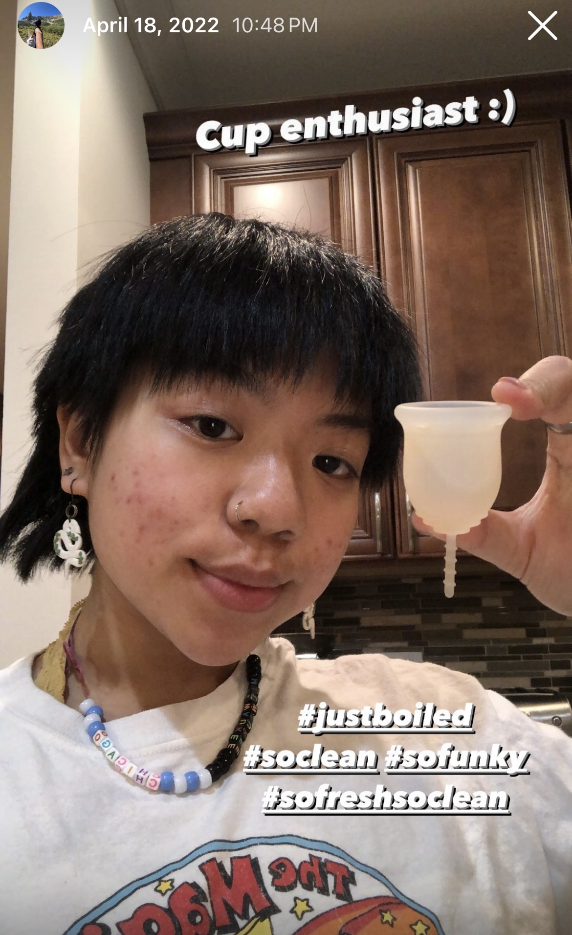
archived Instagram story, circa 2022
Research
Taking a search on what products and brands are currently out there. Lots of pink, black, and green.
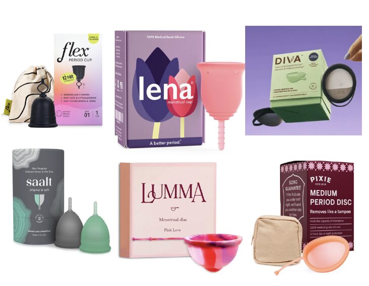
Competition/what's currently on shelves
Ideating
the name of the brand
As a yoga teacher, ease is a huge focus for me in practice as well as while I'm teaching. There is a yoga pose named sukhasana. Sukha, in Sanskrit, means ease.
During the menstruation part of our cycles, it can be a very uncomfortable time. The intention is when you see this product and hear the name, you feel ease and a sense of comfort when using the products.
To accentuate ease, instead of using the word "easily," I changed it to "easely" and added a period at the end, because it's a play on the concepts of menstruation and the punctutation, and our era— point blank, end of sentence, it is what it is. Period.
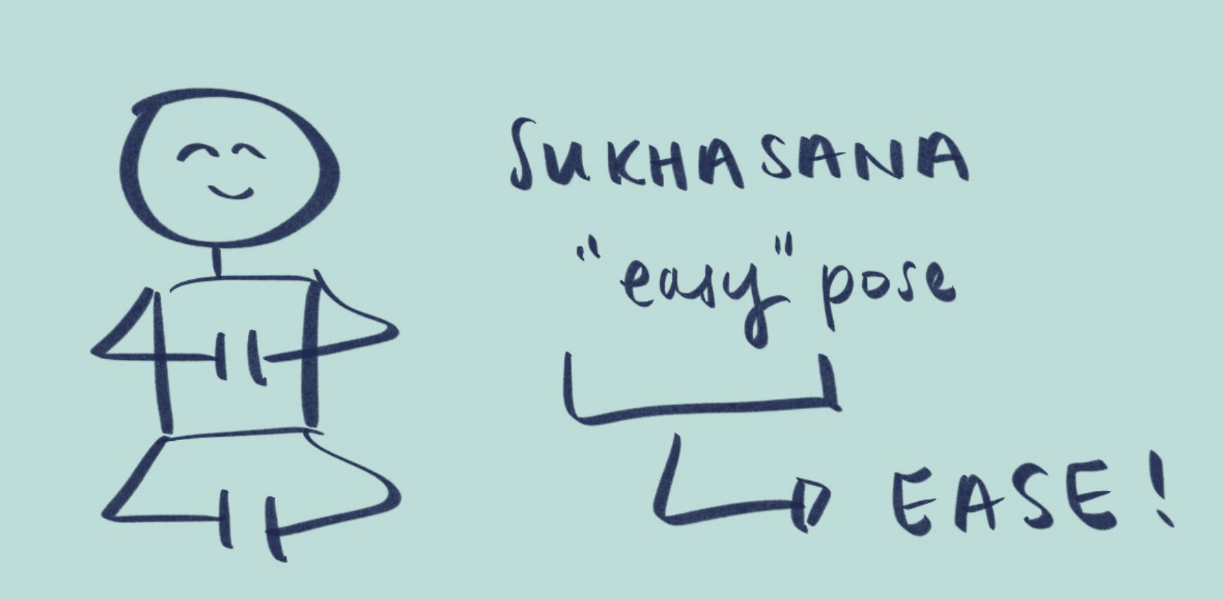
Sketch of Sukhasana: Easy Pose
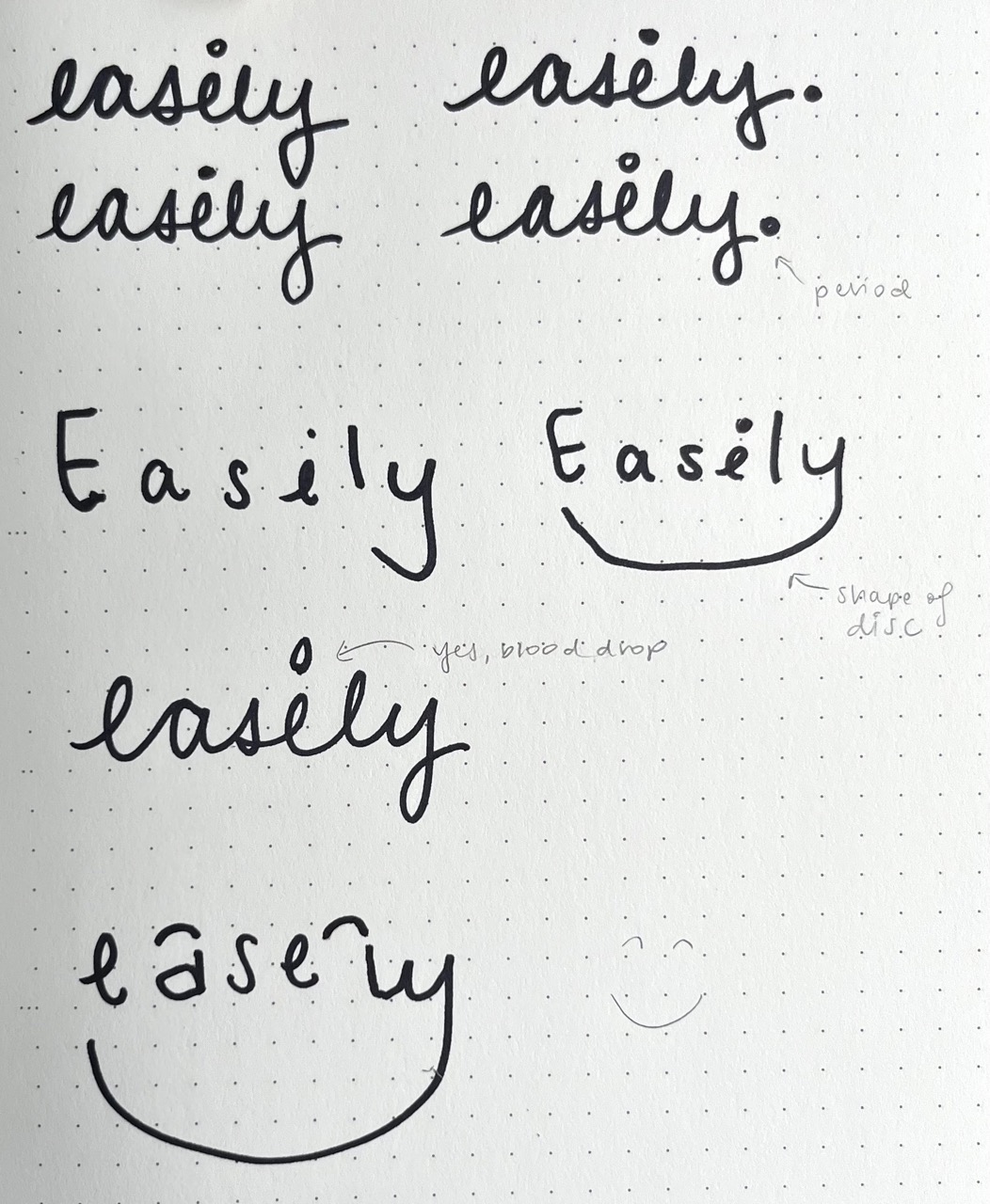
Easely. conceptual sketches
Ideations
three different variations
After ideating multiple options, and with feedback, the first option stood out as it doesn't look like any of the current menstrual brands on shelves.
Instead of a script font, that yes does exude flowiness, I used my own handwriting since it displays a handmade, scrappier feel. Periods and our cycles aren't perfect, a bit messy, if you will.
Utilizing shades of blue exude calm, tranquility, and the red of period creates contrast and accentuates the brand.
For the names of each product, ease was incorporated, for example, rel'ease', and other words that relate to what "ease" embodies.
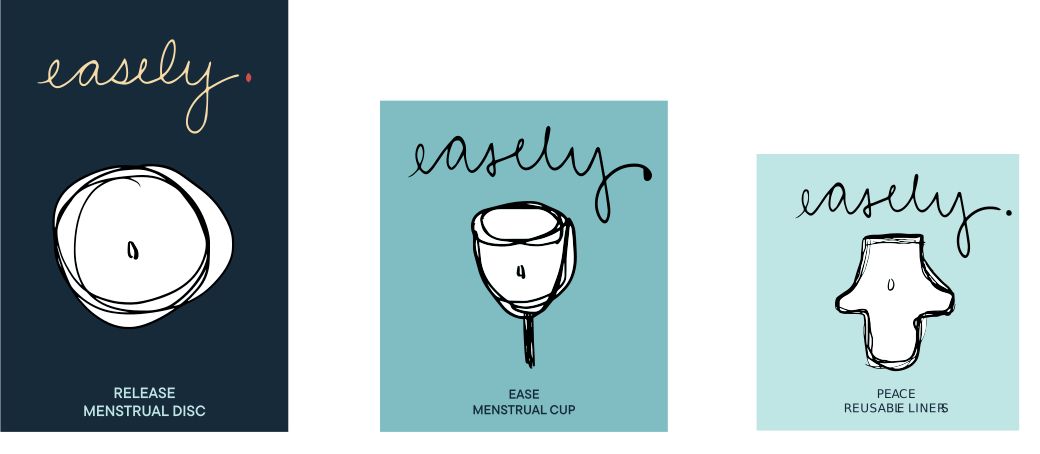
Easely. conceptual sketches - Ideation 1
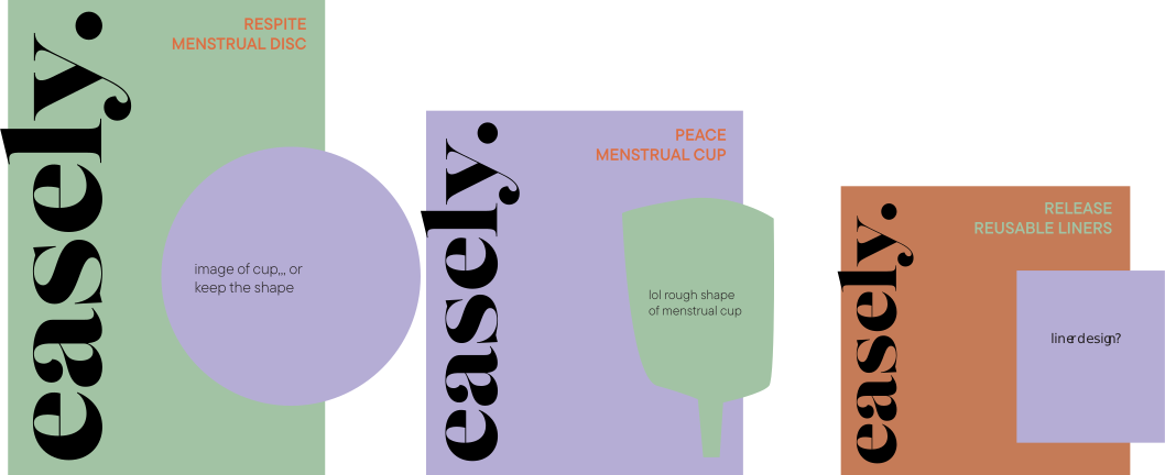
Easely. conceptual sketches - ideation 2
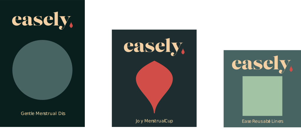
Easely. conceptual sketches - ideation 3
Product
Sketches
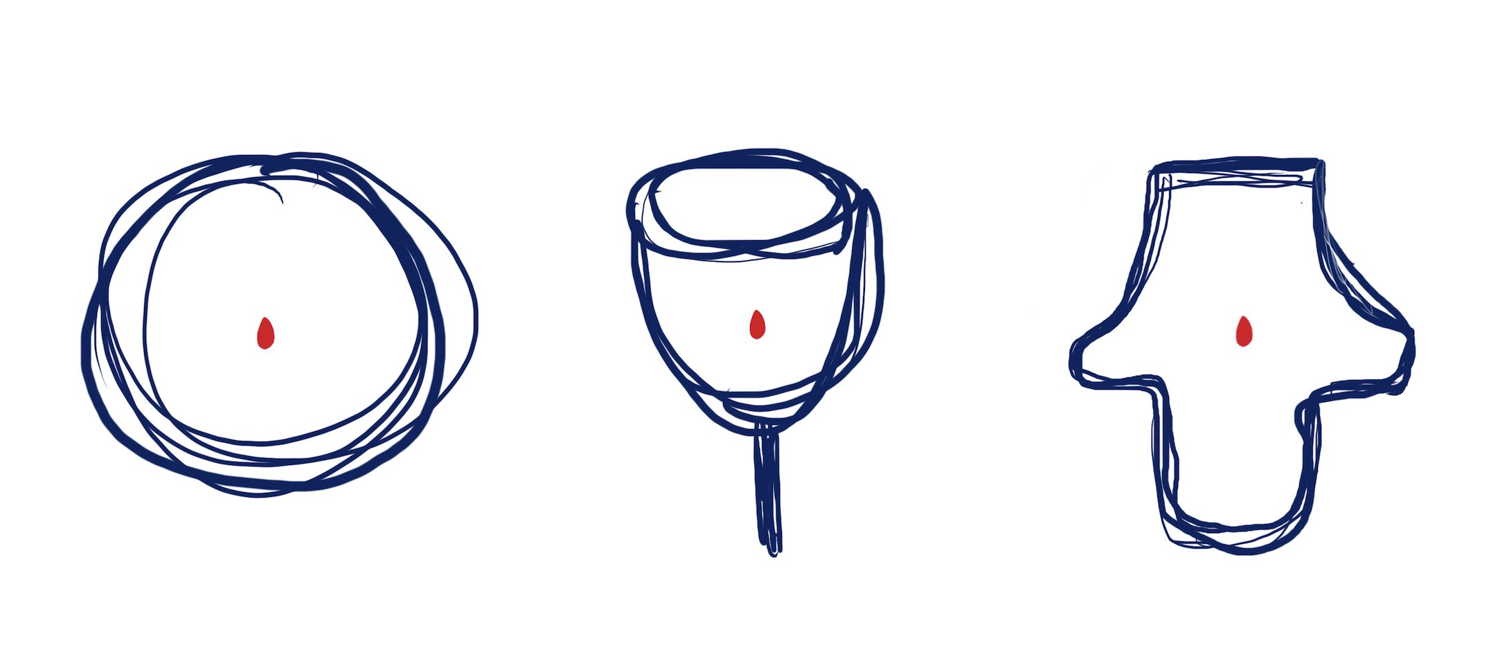
Dielines
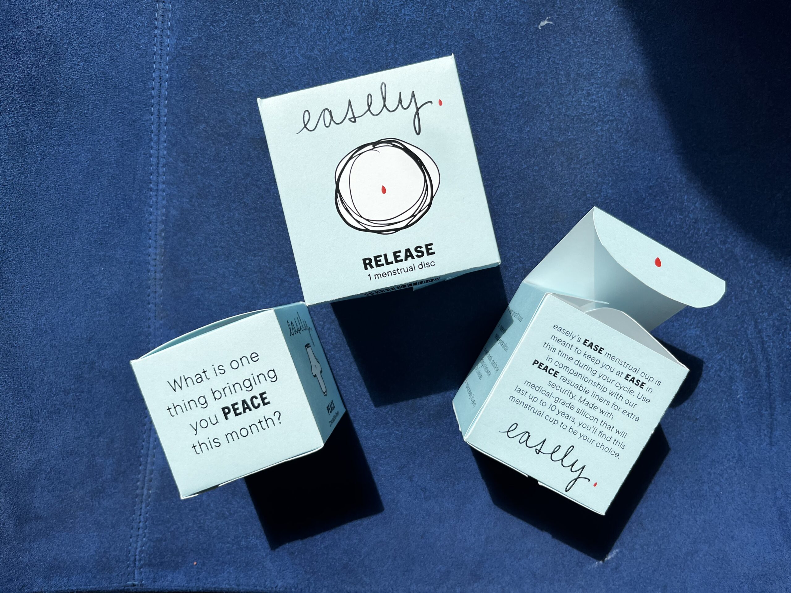
Adding copy to the side panels specialized for each product, barcode on the bottom, and the little blood drop details in the flap where you open and close the package, as bullet points, and as punctuation.
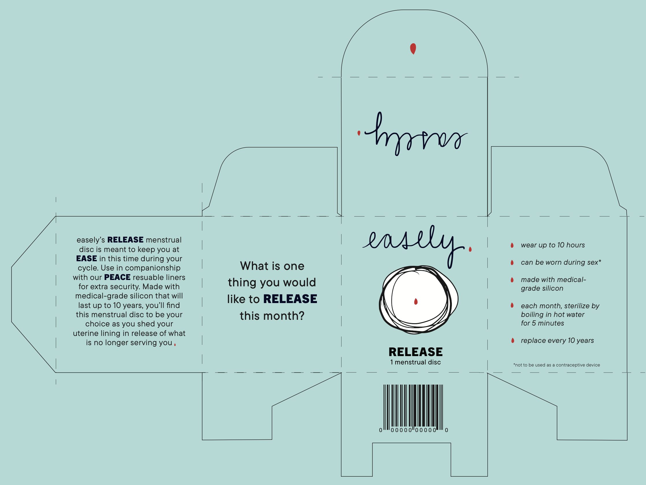
Easely. release - menstrual disc dieline
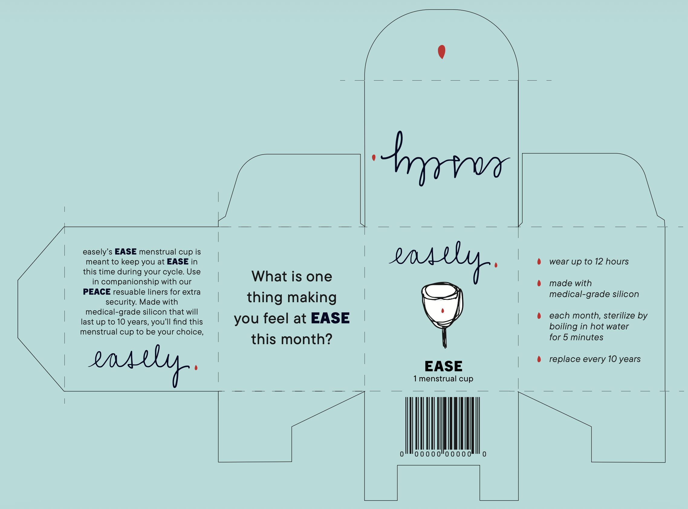
Easely. Ease - menstrual cup dieline
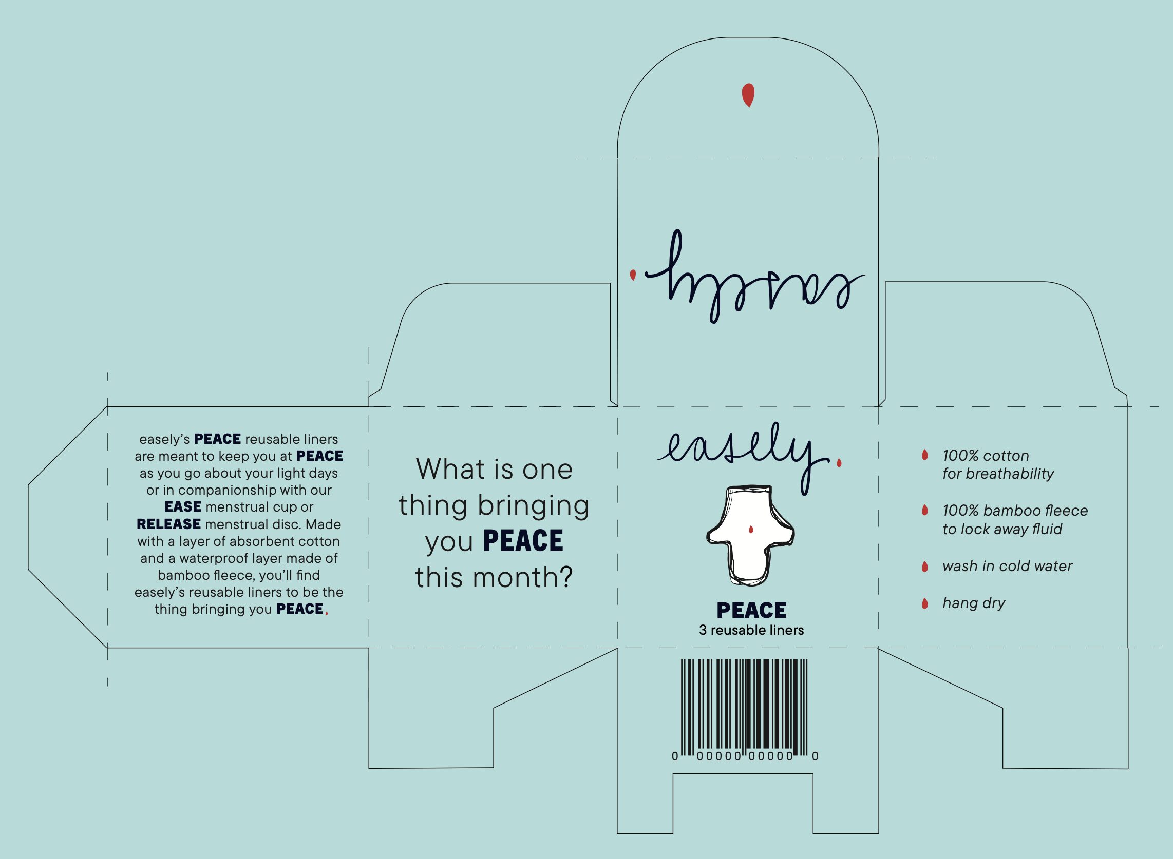
Easely. Peace - menstrual Liners dieline
Packaging
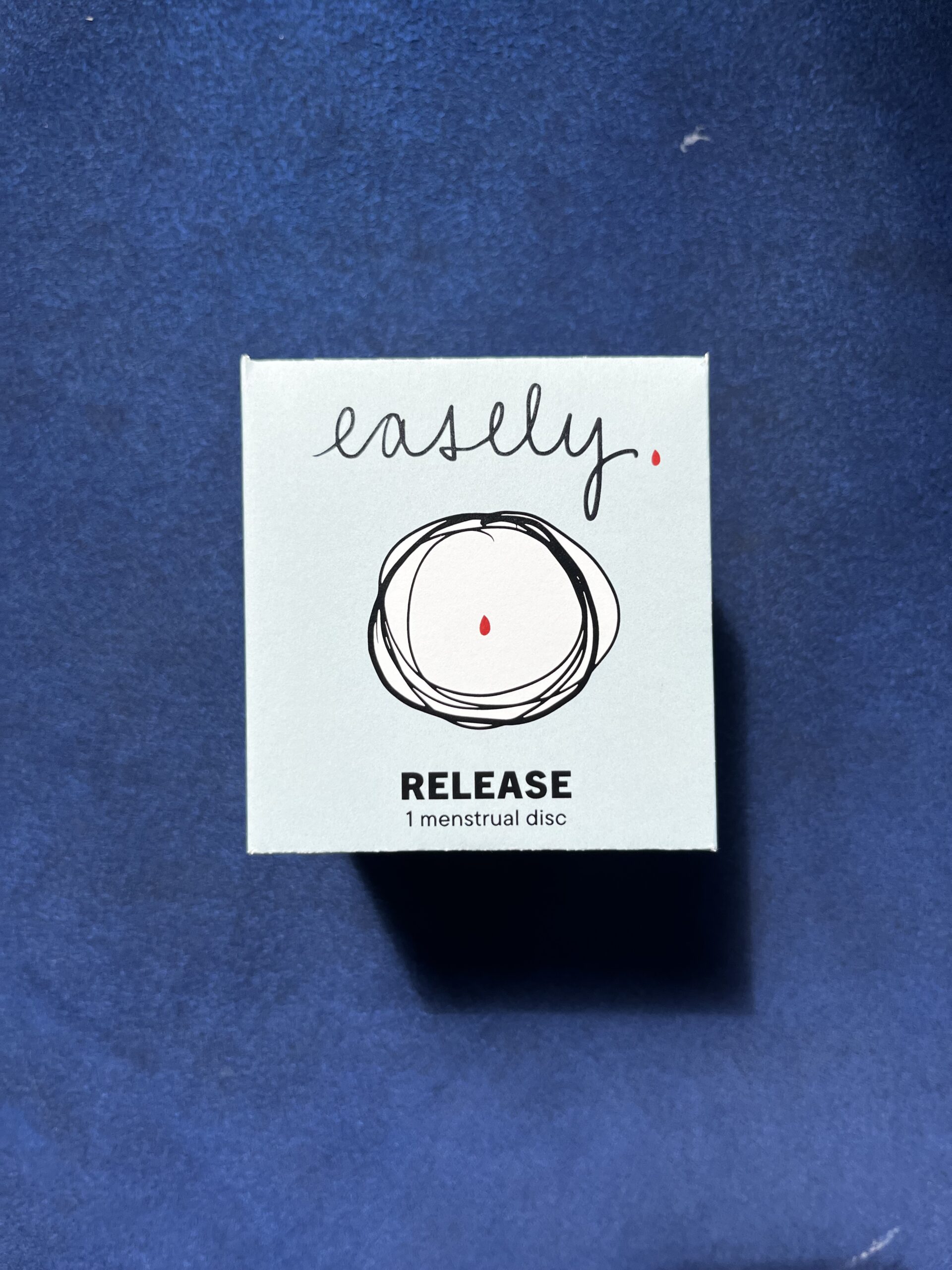
Easely. Release - menstrual Disc front panel
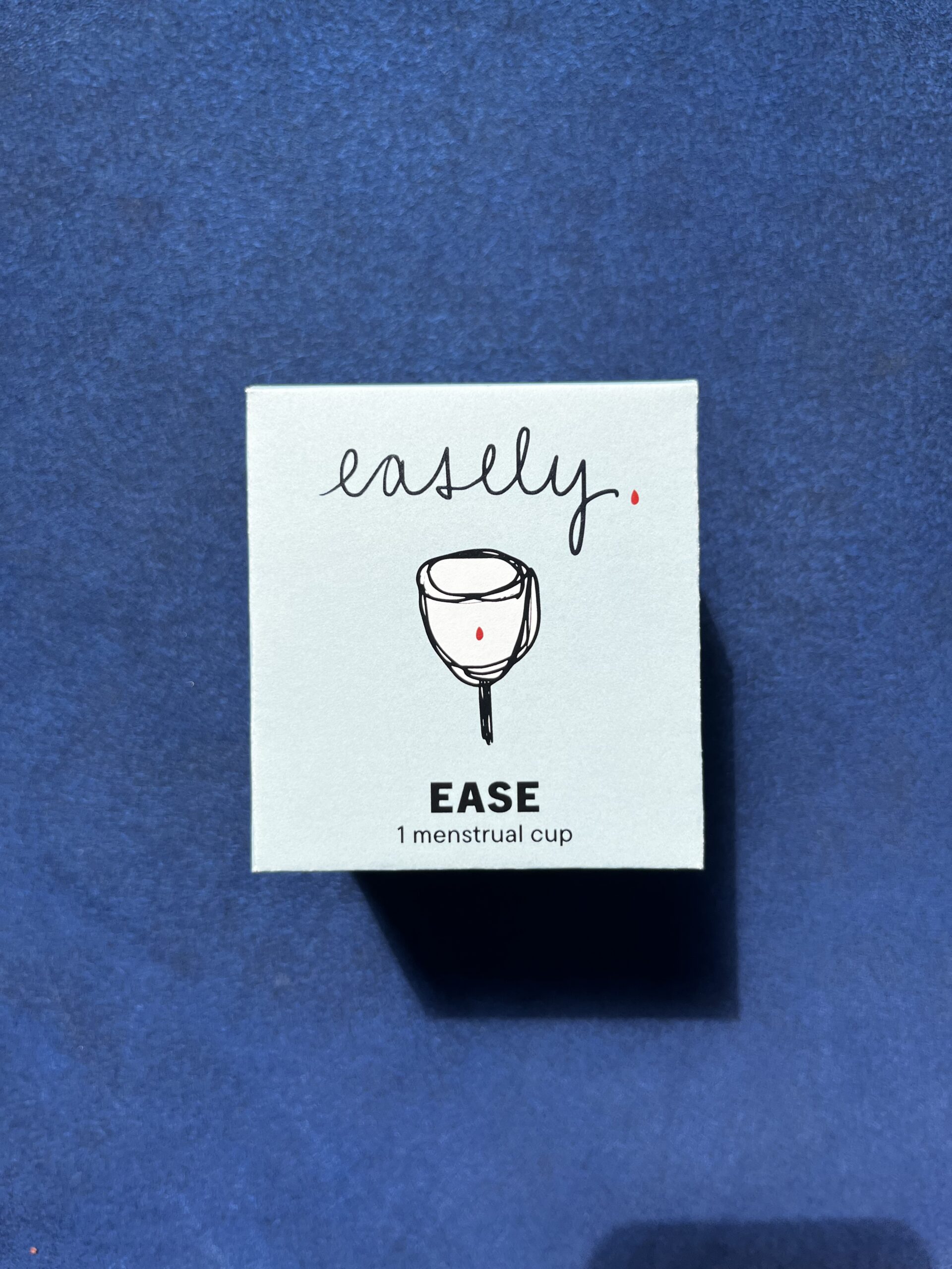
Easely. ease - menstrual cup front panel
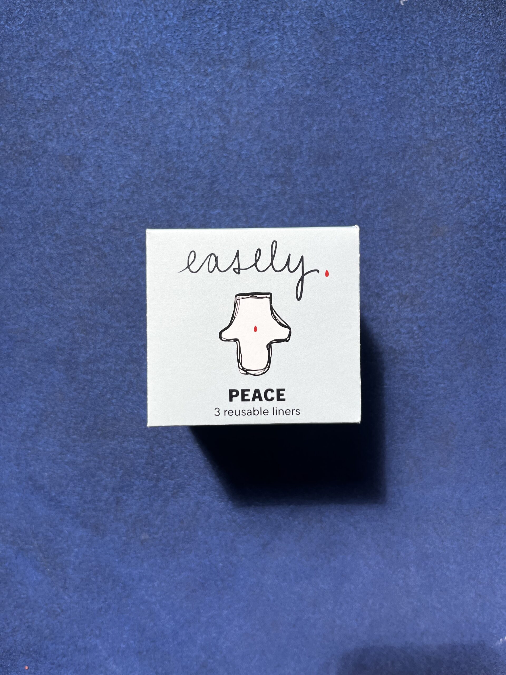
Easely. Peace - menstrual Liners front panel
Shopping Bag
To create an eco-friendly shopping bag, I made a reusable carrier for the disc, cup, and/or liners. First by embroidering the logo onto the bag and then sewing a bag with a drawstring, using blue thread to follow the color guidelines of the brand.
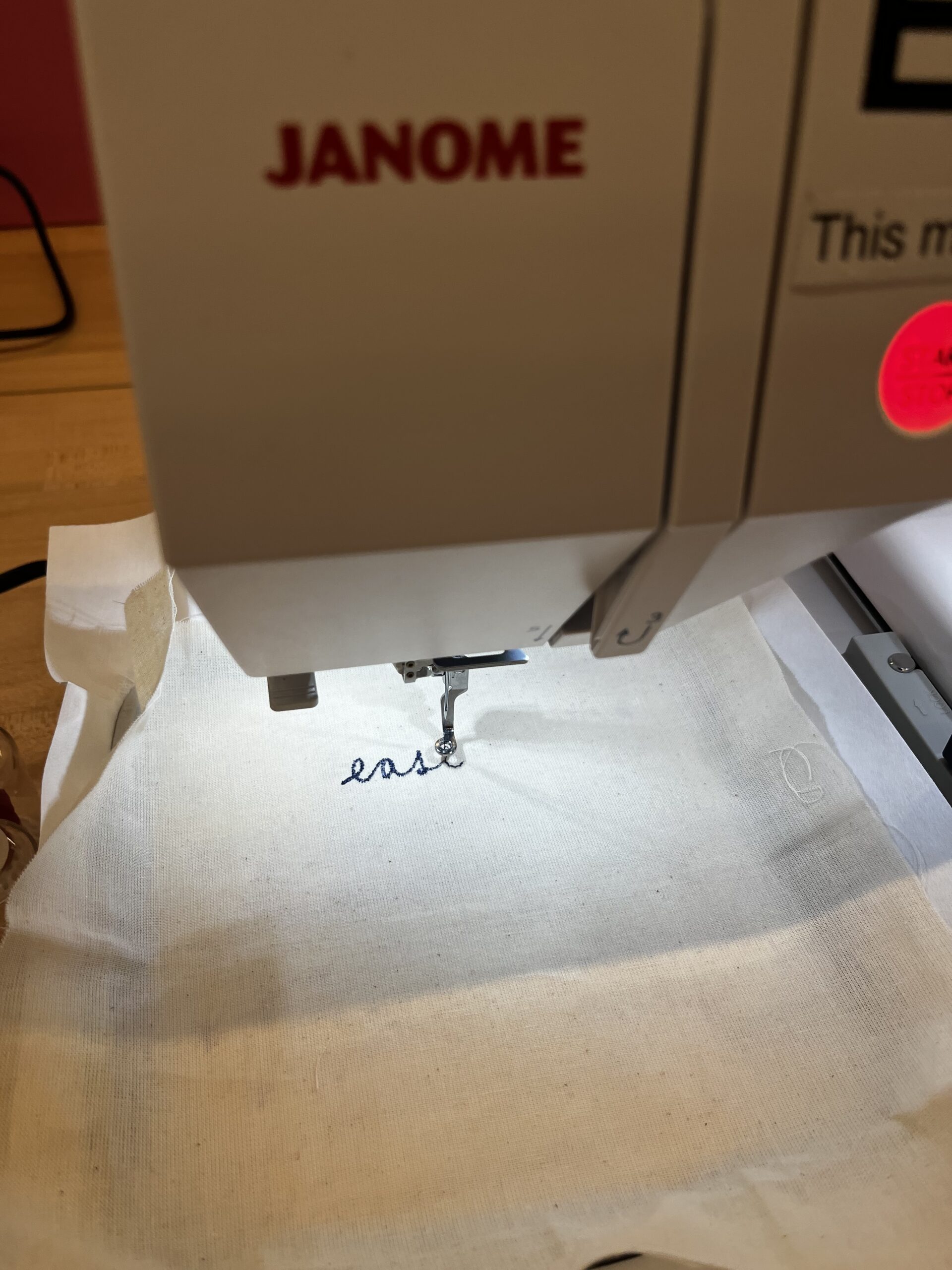
Embroidering easely. logo
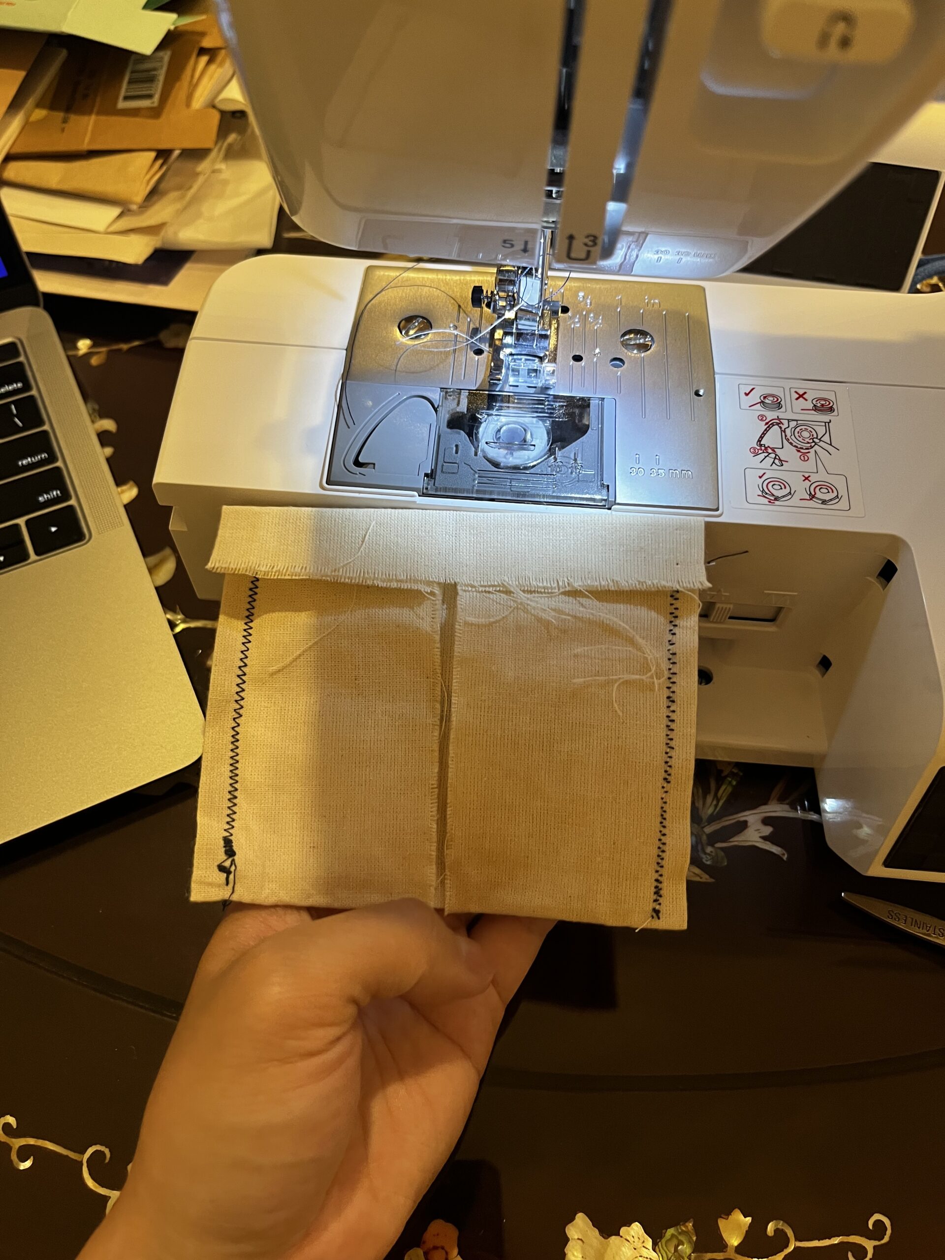
sewing easely. 'shopping' bag
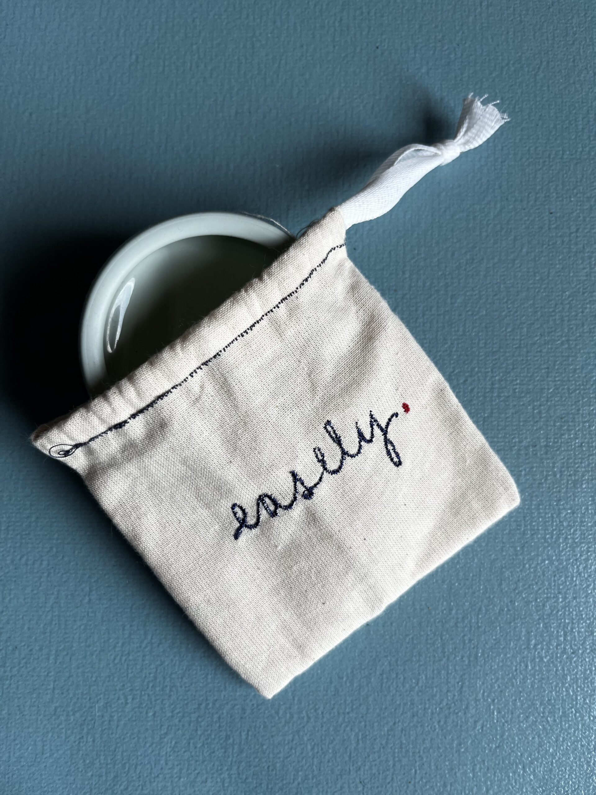
easely. bag with menstrual disc
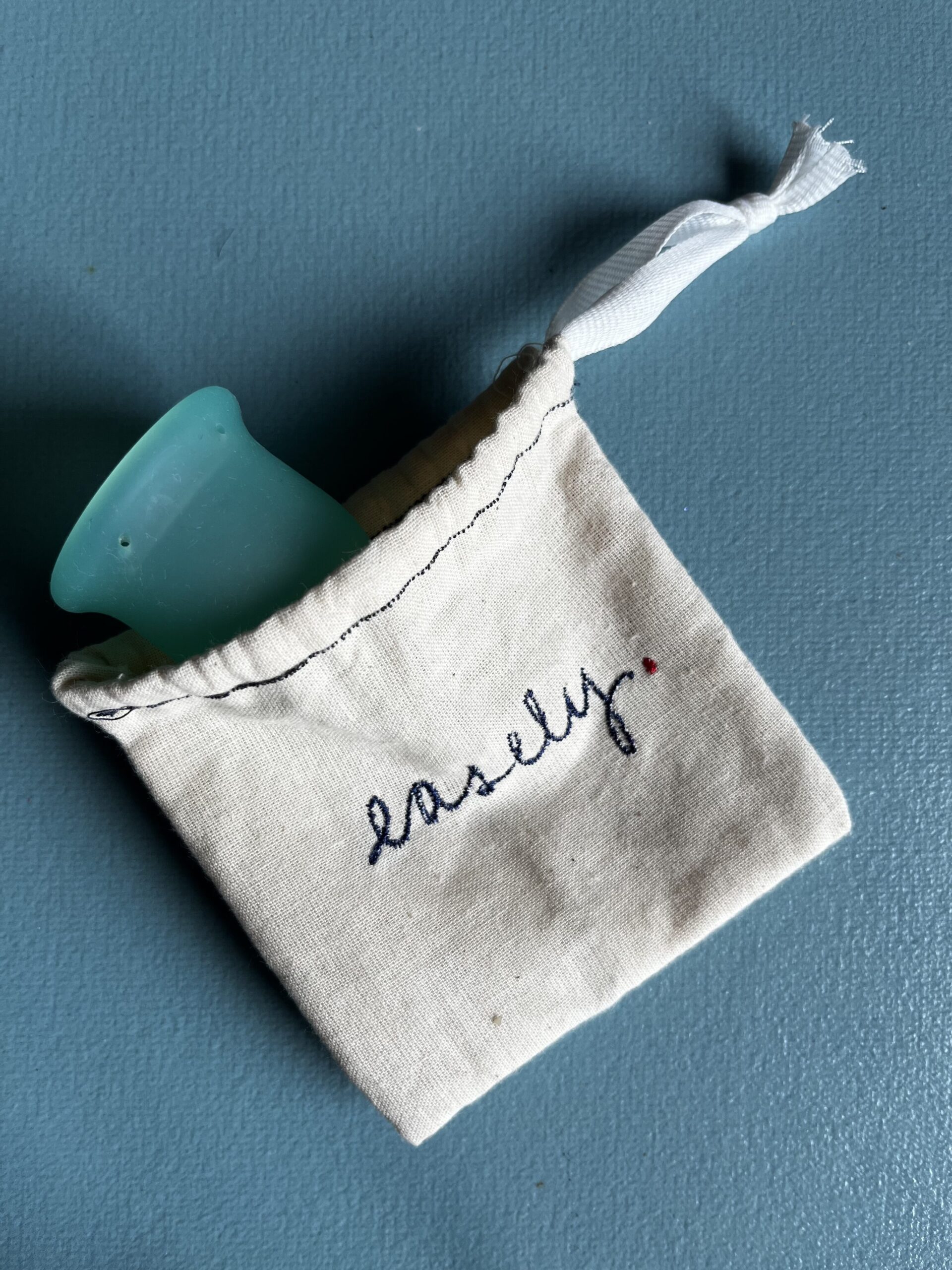
easely. bag with menstrual cup
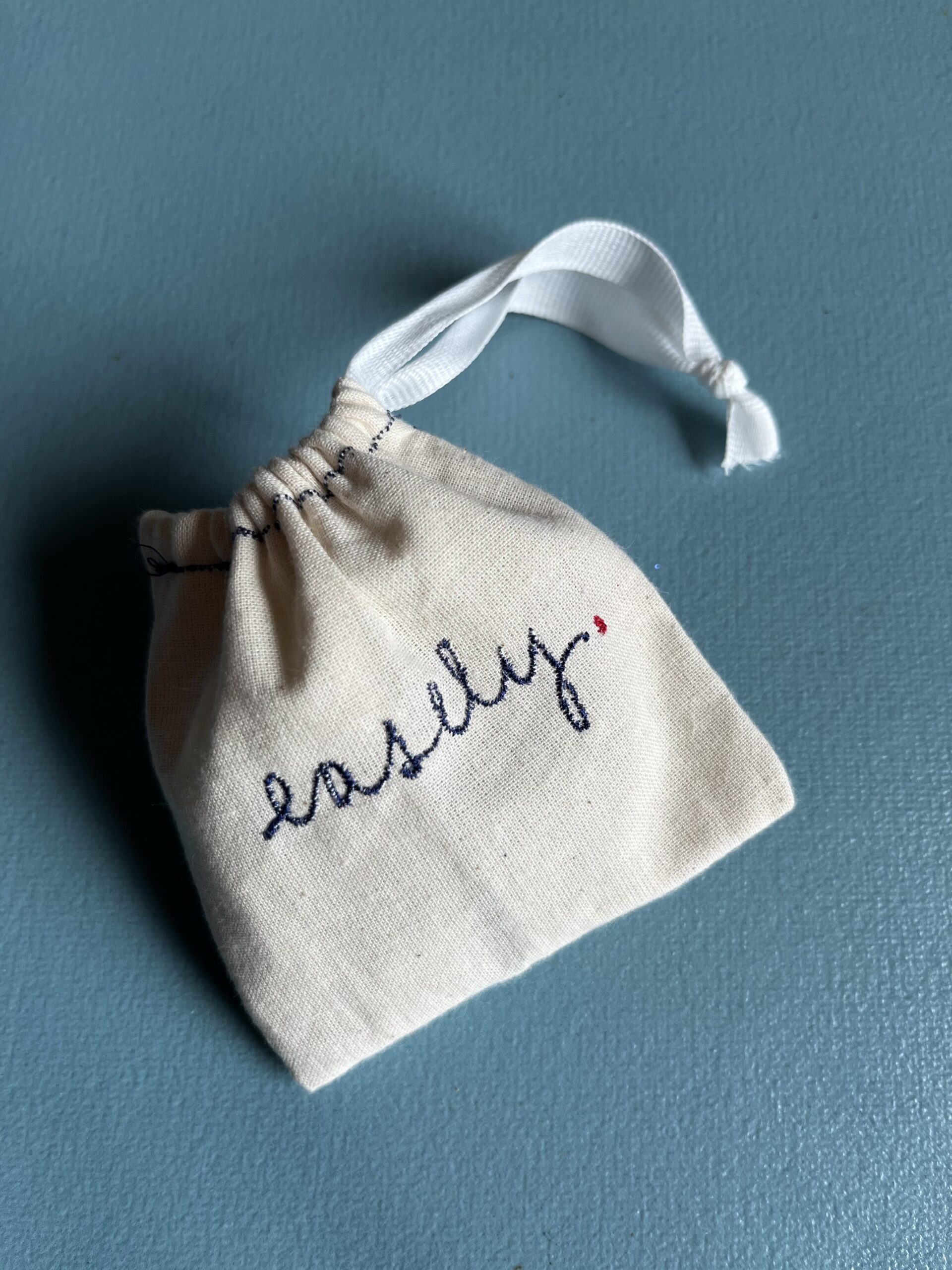
easely. bag closed
© ON MUSINGS 2026. ALL RIGHTS RESERVED.